Overview
PTx is a multi-brand agtech group (Precision Planting + PTx Trimble) formed in 2024. Each team had built their own digital products independently — resulting in divergent UI patterns, inconsistent color usage, and no shared component language. The brief: create a digital design guidelines system that global teams could actually use.
Goal: Build a guidelines system that unifies UI patterns across brands, educates distributed teams on correct usage, and scales as the brand grows.
My Role
- Project management: scoped guideline needs across each digital team, tracked tasks and feedback cycles in Monday.com
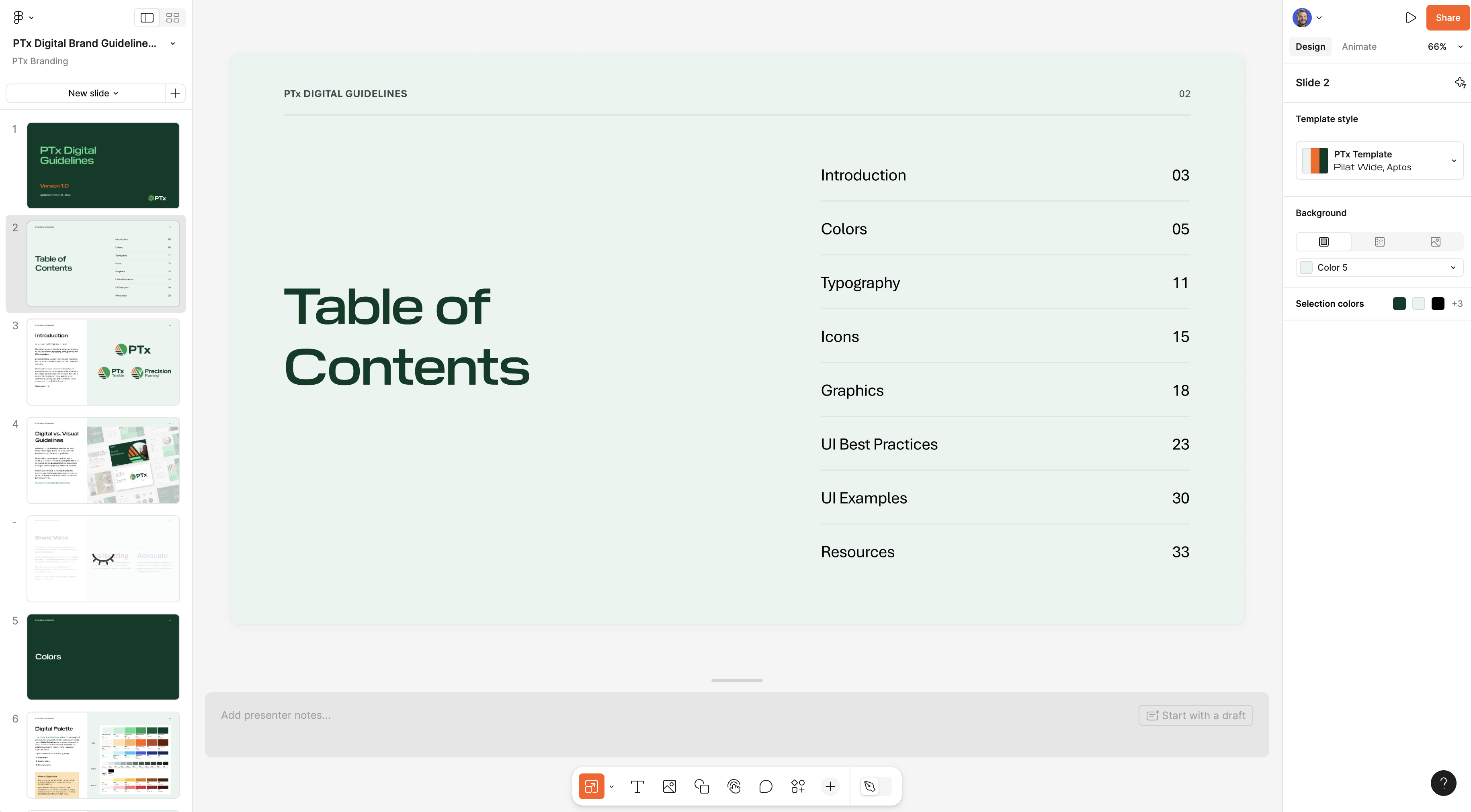
- Design: built the full guidelines document in Figma Slides — layout, visual hierarchy, and interactive examples
- Content: wrote all copy, including usage rationale and "do / don't" examples
Process
Discovery: find the inconsistencies
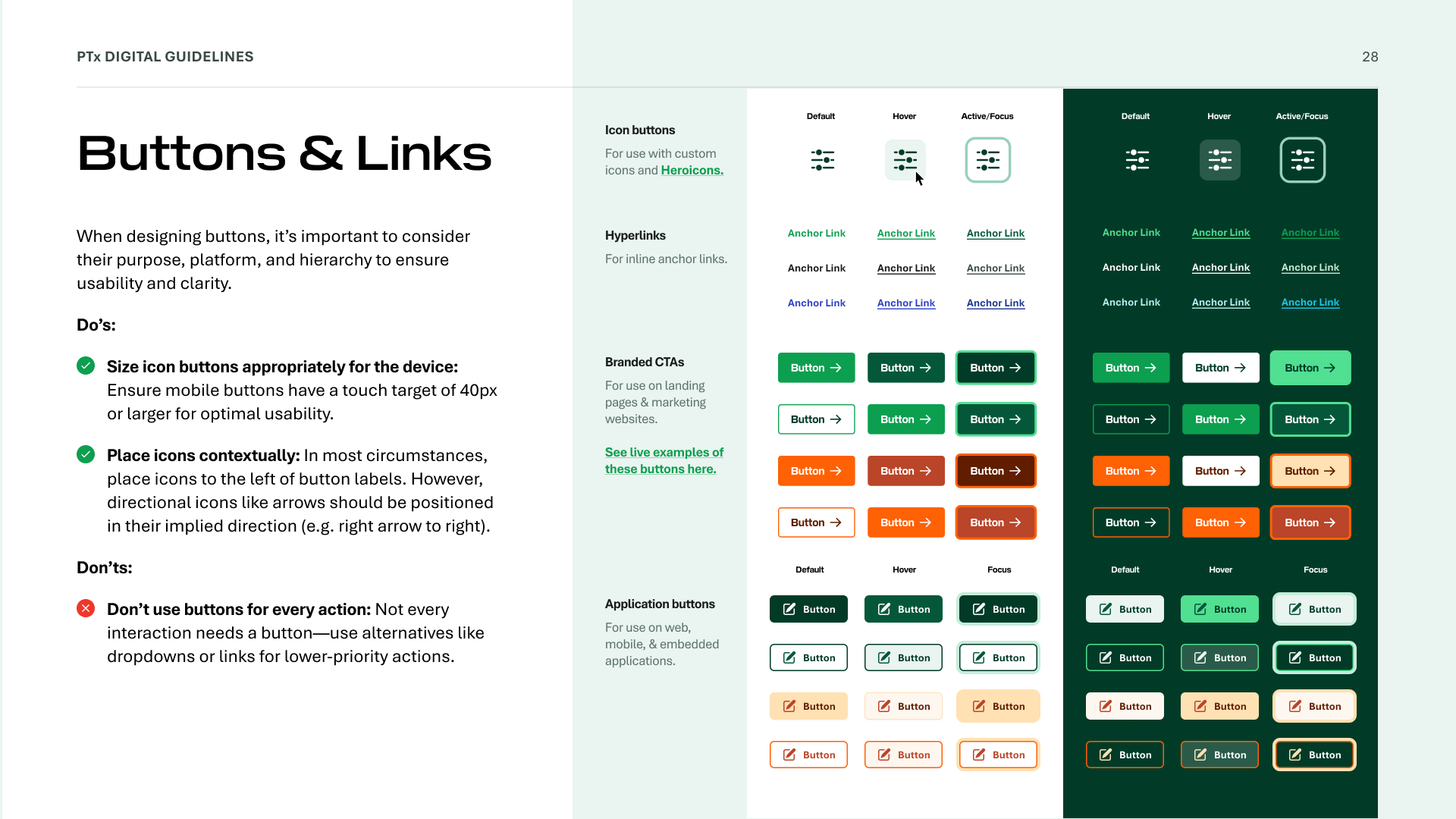
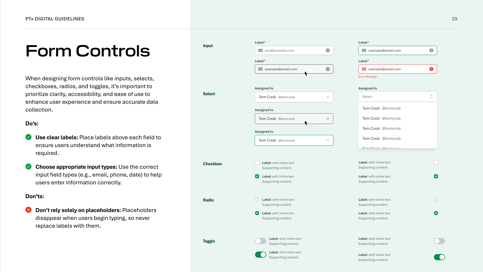
Rather than guessing what to document, I asked each team to share examples of their existing digital work. In a collaborative FigJam session, we mapped patterns across all submissions and identified where UI elements diverged most: color application, button states, typography hierarchy, and form controls.
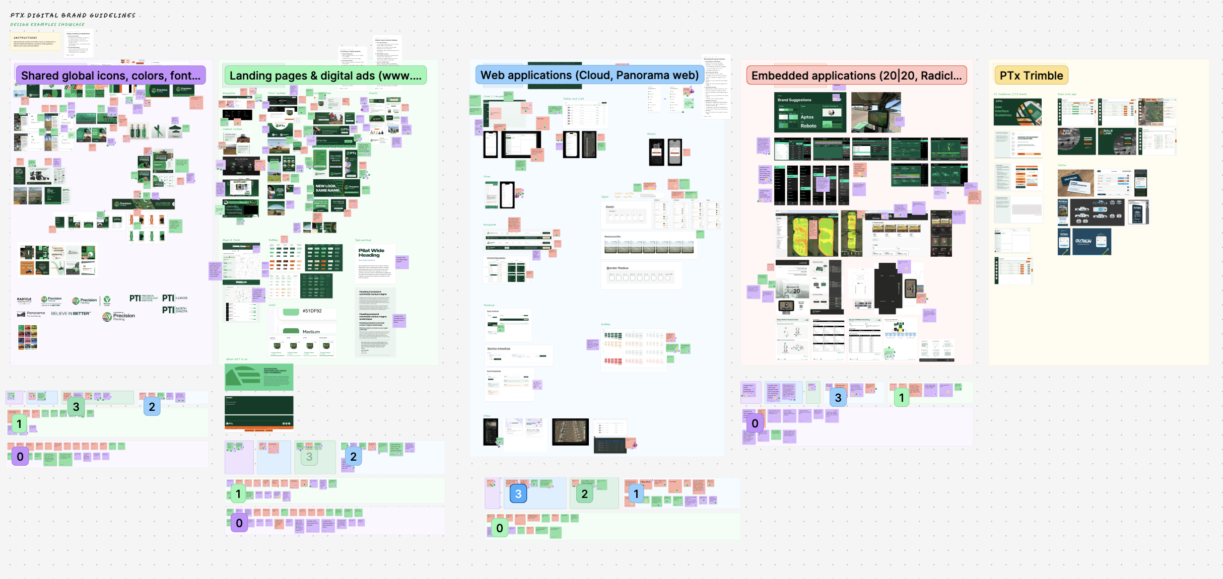
This approach kept the scope focused on real problems rather than hypothetical edge cases. The guideline list came directly from what teams had built, not from first principles.
Format choice: Figma Slides
Figma Slides was chosen over a traditional doc or Storybook instance because the primary audience was design teams who live in Figma. The format supported inline previews, interactive state toggles, and easy version sharing — making the guidelines something teams would actually open, not just bookmark.
Outcome
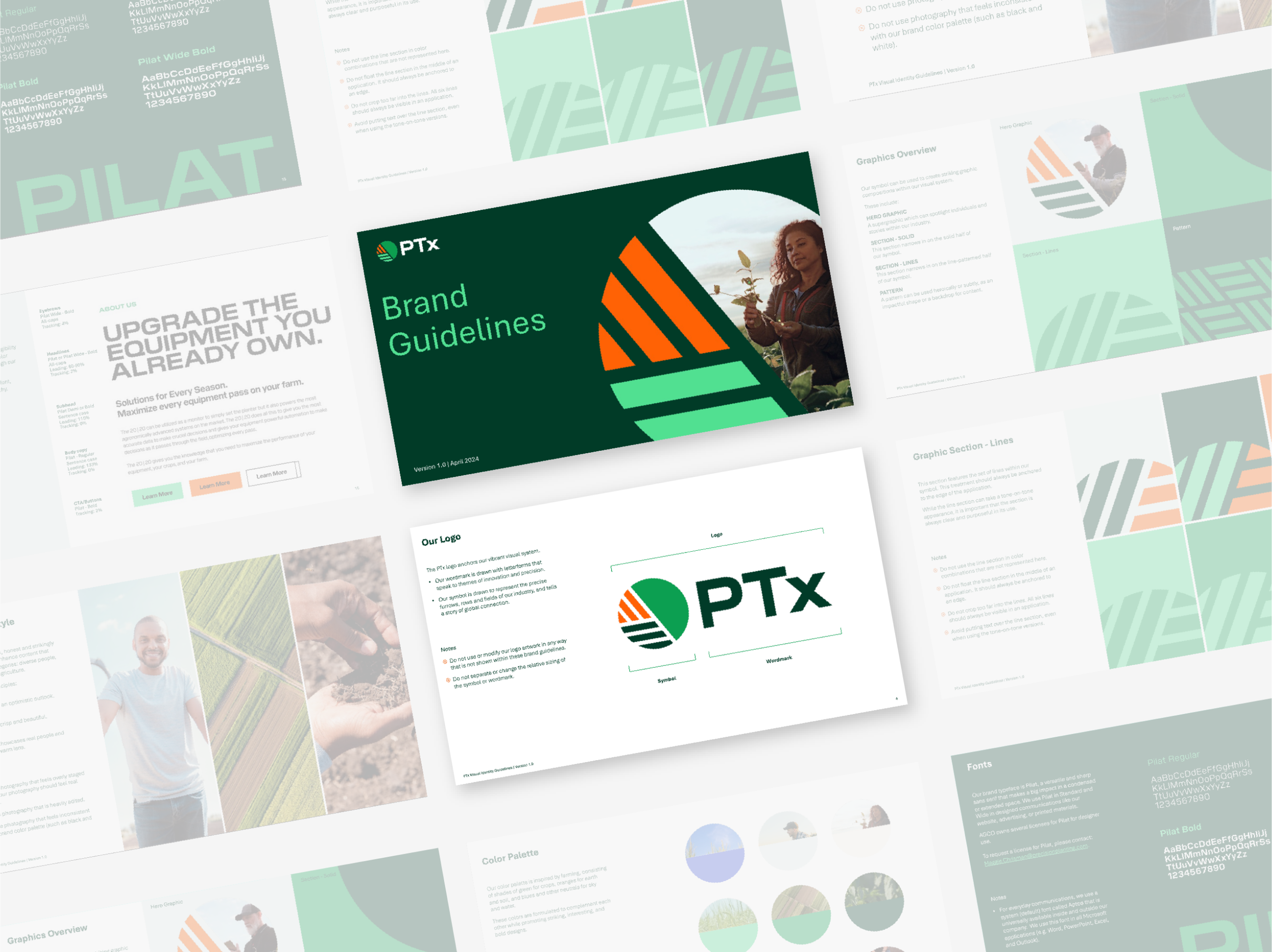
The guidelines shipped in late 2024 and are now the reference point for all new PTx digital work. Coverage includes: typography scale, color system, spacing tokens, icon packs, button and form patterns, layout grid, and motion guidelines.
Designed to be descriptive, not prescriptive — teams understand the why behind each decision, not just the rule.